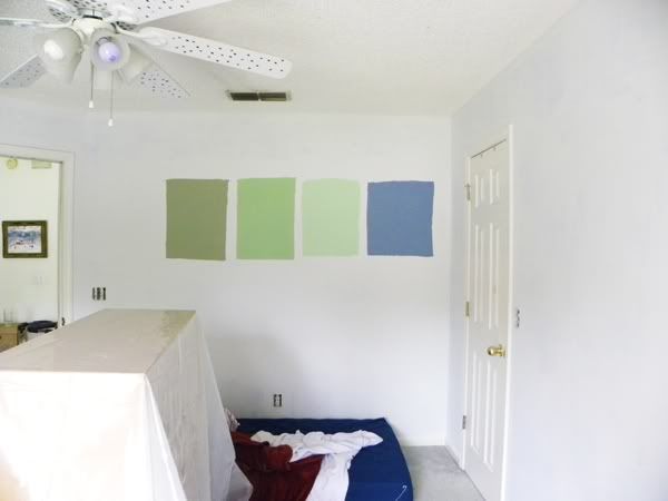
So where I left off yesterday, we had a freshly primer-ed guest room just waiting to get some color added.
I had spent nearly an hour at the Home Depot paint counter in pursuit of three sample Behr colors for the wall, and along with an older sample of Valspar, I had four colors to test on the wall. After all the cleaning, spackling, sanding, and priming, I was dying to get to the fun part--transforming the room!
So here are the samples in all their glory:
... So?
What do you think?
Do you love?
... Well for me, after I stepped back to take a better look at these samples, all I could hear in my head was a sad trumpet sound.
Yeah. Unfortunately, I'm not wild about any of these colors.
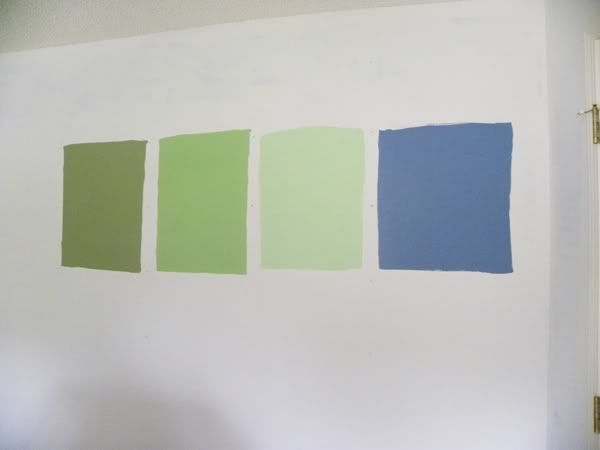
From left to right: "Sagey" from Behr, "Desert Cactus" by Behr, "Rockwood Jade" by Behr, and "Hydrangea" by Valspar.
Way before we even started this process, I asked my dad what color he wanted the guest room to be. He said, almost verbatim, "A creamy, sort of dark... olive green, but not too olive-y." That's... my dad. This is the same guy who also made a case for painting the family room beige, because the couches are dark tan, the recliner is beige, and the side tables are blond. He doesn't seem to have an eye for cohesiveness. (Now if you have questions on military history, he's your guy.)
So that's the purpose of the greens.
The Sagey (far left) is the best I could get in the Behr paint as far as matching my dad's convoluted description. It's as close to olive as I was willing to go, and while it's not bad, it's going to clash horribly with the existing furniture in that room.
The second from the left, Desert Cactus, is actually my favorite of those four, but that's not saying much. It didn't photograph well, and in person, it's not any better. It'd be easiest to match with the furniture and to dress up, but it still didn't feel right.
As I was painting Rockwood Jade (second from the right) on the wall, I didn't like it. We got rid of the sky blue and clouds to eliminate the whimsy and give this room a more sophisticated vibe, but the Jade just brought us right back to whimsy. (I even used the word "cartoonish" to my mum when we were discussing it.)
We picked up the Hydrangea sample early last week when we were in the early stages of painting Shane's room. But after doing all that work to take the blue off the walls, it felt weird to turn around and consider another blue. Moreover, this one is sophisticated, but it's just not right for this room. Shame. It's a gorgeous color and I have a feeling, when my dad finally looks at these swatches, that's the color he'll choose.
So I was back to square one and $10 in the hole as far as samples. (Those paints will be great for little arts and crafts projects though, so it's not a total waste.)
I tried loading some room photos into Behr's webpage to paint it virtually, but the system kept freezing. So, on to Sherwin-Williams!
I stayed in the green-blue range for the most part, since anything from beige to red was automatically rejected by my dad. He also deeply hates purples as wall colors, he's quirky. It's his house, I'm just painting it.
So here we go! Are you ready for some color samples?!

"Blue Cruise" is along the same lines as the blue we just took off the walls, but with darker undertones to give it a more mature vibe.
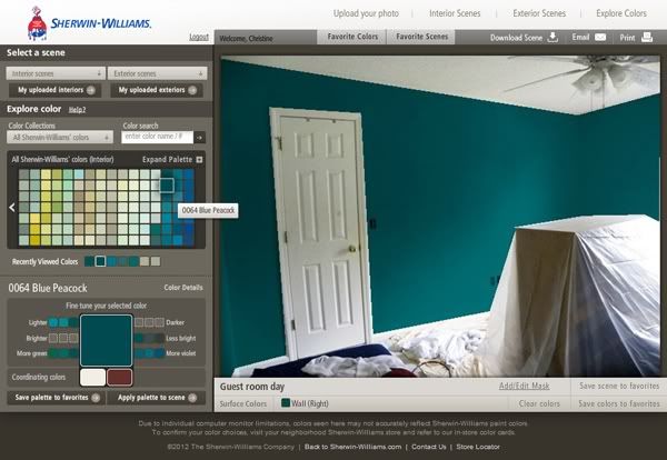
"Blue Peacock" was a swatch I did just for fun, thinking that there's at least a 90% chance I'm going to use this color somewhere in my future house. I didn't think my parents would go for such a bold color. But when Mum saw this color she said, "Oooh, I like that one!" and asked me to scroll back to it two more times.
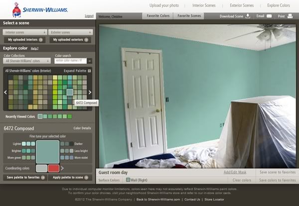
"Composed" walks that line between green and blue without looking all seafoam-y. It's also not too light or dark.

"Country Squire" was also a color I did for fun. This one has more green than "Blue Peacock" but also earned an unexpected gasp from my mum.
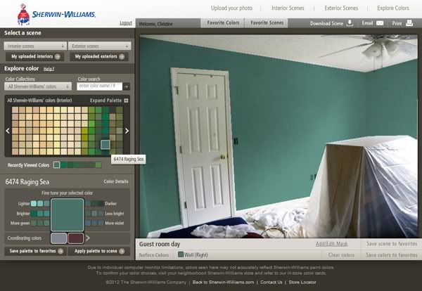
"Raging Sea" is one of my favorites for this room. I'm a realist--they aren't going to choose a bold color for this room--but I will make a strong case for this color, I think it's perfect. And it really does look like a stormy ocean!

"Rookwood Sash Green" is along the same lines as "Raging Sea," but with a little more blue.
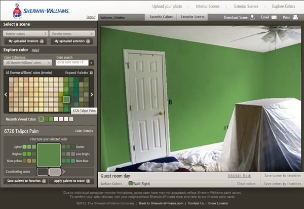
"Talipot Palm" has that creamy split-pea almost-olive quality I think my dad was looking for. Mum instantly rejected this one on sight, but even she has to agree, this looks a lot like my dad's description.
That exhausted my real options for Sherwin-Williams (I did a LOT more swatches for fun, including tangerines, pinks, and yes, royal purple) so I went to Benjamin Moore next.
A lot of my favorite Benjamin Moore colors were duplicates, more or less, of the Sherwin-Williams swatches I'd already done, so I just saved a few screencaps of the ones that stood out as different.
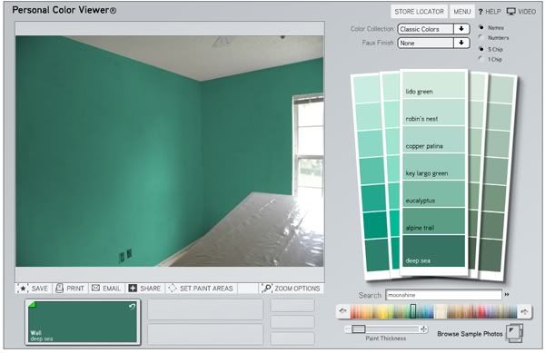
"Deep Sea" is gorgeous and green! I love the ones that aren't too yellow.
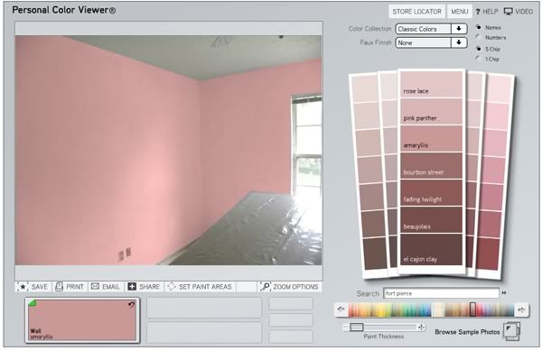
"Amaryllis" was just for fun... because it's called "Amaryllis."
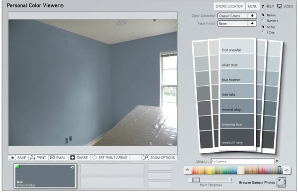
"Brittania Blue" is very sophisticated, a little more gray than blue (which could be an advantage).

"Hemlock" is like a lighter, bluer version of "Brittania Blue," perhaps with a bit more dimension.
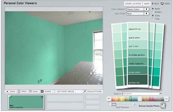
"Medici Malachite" is probably going to be way too green and bright. It's bordering on seafoam.

I loooove "Ocean Floor," I would march right out and buy that color right now if I had complete creative control over this room. But gray-blue isn't something everyone can agree on, ultimately. (And admittedly, I've been on a gray kick that's nothing short of suspicious.)

"Palm Trees" is something you'd find in a quintessential Florida home, so I felt it needed to be included. Luckily it has more blue in it than most of the alternatives (like the Talipot Palm from Sherwin-Williams.)
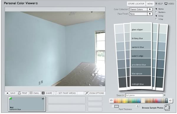
As far as light, airy colors go, I think "Santorini Blue" is my favorite. This is so close to a neutral that the decor could almost go in any direction. (Then again, maybe I'm stuck on it because What Happened In Santorini was such a huge plot point in the second season of Gossip Girl.)
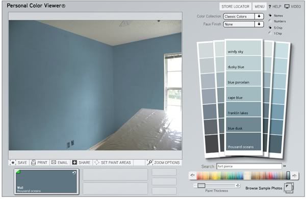
"Thousand Oceans" is another blue-gray that would look amazing in this room.

"Weeping Willow" is another one I chose with my dad in mind. He's a big fan of willow trees (we have one in our back yard) and this color is unexpectedly close to his olive-but-not-too-olive-y description. I actually really like it!
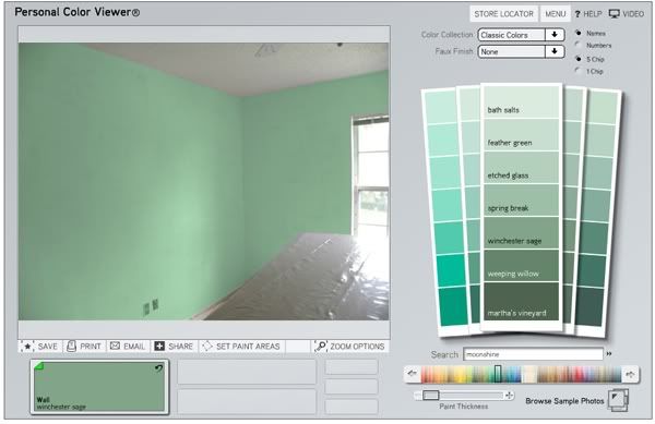
And last but not least, "Winchester Sage," another color chosen for my dad; this one is a little closer to mint than a lot of the others.
Now comes the important part: Getting everyone to agree on a color!
Which color would you choose?
Seriously. I really want to know. Leave a comment telling me which color you'd choose and why!
Given your father's preference, my choice would either be 'Raging Sea' or 'Weeping Willow'. I'm leaning towards 'Raging Sea'. I like the blue tones and I think it's a bit more sophisticated, and a color you'd be more likely to see in an inn or guest house. But I think either color would work well in that room.
ReplyDeleteFirst, I just have to say that my hands down favorite is Blue Peacock. Just as a personal preference. I love vibrant colors that pop like that.
ReplyDeleteBut for the purposes of this room I like Raging Sea or Brittana Blue or Ocean Floor. I think the blue-gray tone is really nice for a guest room because it would compliment a lot of furniture and bedding colors. And like Stephanie, with your dad's preference for green in mind I'm leaning a little more towards Raging Sea.
I liked Blue Peacock & Thousand Oceans but based on what your dad might want I say go for Weeping Willow.
ReplyDelete